Throughout the world from 1831-1832, cholera travelled from one territory to another rapidly, defying quarantine efforts. Its movement within a body was equally swift and terrifying, reportedly killing someone in the evening who had been well in the morning. A before and after drawing of a young Venetian woman struck with cholera illustrated the effects of dehydration that gave her a cadaverous aspect, gaunt features and a bluish coloration, typical of the disease. Her clothing changed from a dress to a chemise or nightgown, but her hairstyle, albeit mussed, was the same, indicating that this transformation occurred on the same day (fig. 5).
Cholera’s dramatic impact, the lack of experience with or understanding of the disease, and the ever-growing panic inspired doctors to study the disease and publish reports for medical and popular audiences. For example, the Boston Medical and Surgical Journal published the following statement:
It will not be the fault of the present race of physicians if posterity should obtain an inadequate idea of the history of the existing epidemic … The medical pen has been, for the last two years, teeming with productions on this subject; and we still go on, with unabated vigor and industry, adding to the number … At present, the mania for publication seems distinctly transmitted to this country, and we already rival our transatlantic friends in fertility on this topic.
As we can see, even medical language was “infected” with cholera mania, and many ostensibly objective resources like medical treatises and maps reflected and contributed to the growing fears associated with cholera.
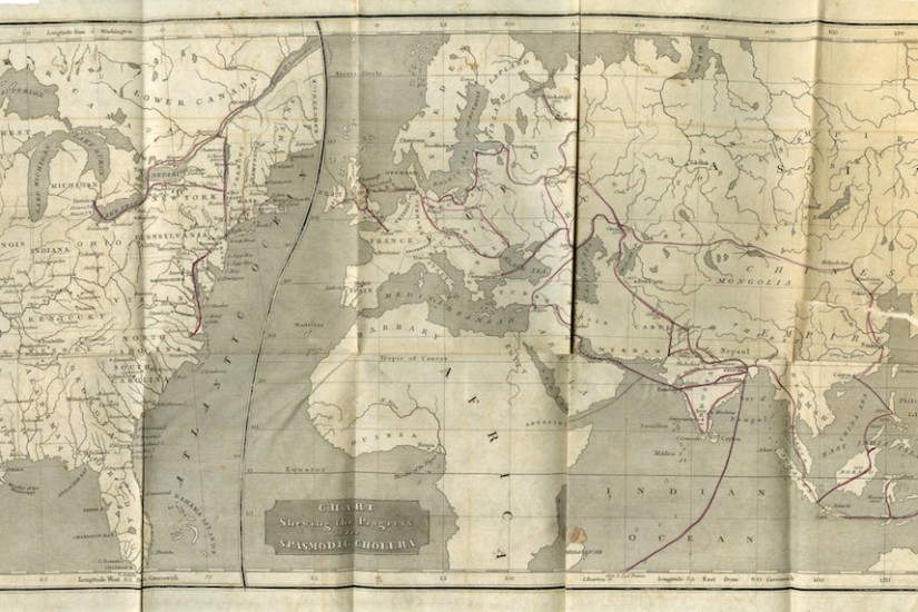
Cholera maps have been examined by scholars as examples of nineteenth-century maps or disease history maps (i.e., Susan Schulten and Tom Koch), but they have not been studied as companions to the treatises they accompanied wherein fears about the disease were manifested in print. Using the texts as guides to read the maps can show how the fears conveyed in the text became visual and spatial on what we might expect to be an objective tool and unmediated artifact of the pandemic.
The visual impact of the maps and the production of that impact was designed to reflect the terror associated with the disease. The fact that readers of the maps had to physically unfold them also invokes the readers’ bodies and connects them with trails of sickness in the red lines (figs. 6-8). The maps opened to reveal a linear or webbed pattern of disease circulation (I don’t use the word “contagion” here because whether the disease was contagious or not was in dispute, and none of the maps used the word). In each, a printed dotted line marked the spreading disease. This line was then covered by hand with a red line. The color of blood, danger, and alarm, the red lines were not a neutral feature. They attest to the fear of the disease along the trail of sick bodies that cholera left in its wake (figs. 9 and 10).
Doctors agreed that fear was one of the predisposing conditions of cholera. In other words, one could catch cholera if one was afraid of it. Doctors believed that fear could provoke a physical reaction in a body (sometimes called “embarrassment to the heart”) that would weaken the system, making one more vulnerable to the disease. What’s worse, the physical manifestations of fear resembled the initial symptoms of cholera (fever, cramping, irregular pulse, and diarrhea), making it difficult to discern whether someone was infected with the cholera bacteria or terror. Dr. Amariah Brigham, in his text that included a map, wrote, “Almost every person who has written upon the causes that produce the cholera, mentions the fear of the disease, as among the most frequent and powerful.”
When we look at the different examples of cholera maps that were folded into book-length treatises on the disease, we have to consider the information they offer, but also their embodied affect—their role in furthering fears about the dreaded disease and, therefore, endangering the bodies of readers.


